https://www.flickr.com/photos/lozzietheunicorn/sets/72157650965314959/
(click the link to see all photos)
These pictures are test shots for my digipak. I like the photos where i have used depth of field. I plan to edit these photos like in the plan for my digipak. Perhaps I could use these photos to create a lyric book?

Tuesday, 21 October 2014

Monday, 20 October 2014

Friday, 17 October 2014

Tuesday, 14 October 2014
Digipak plan and stuff

This is my digipak plan (so far).
1. (Pink circle with lines through it) I plan to have the band members face aligned and edited with a neon colour scheme for the front cover.
2. (The green and grey thing with grey blocks) This is the back cover, the grey block represent track listing. I plan to have a landscape image with the image of the band faded into it.
3. (the sound board) To represent the electronic side, I plan to have an image of the studio/ instruments/ sound board.
4. (The audience) I want an image of a live performance/ audience to represent the rock/ indie genre, but also the neon lights to show electronic. I think this will work well since there will be a dvd accompanying the cd within the digipak.
5. (The question mark) I am unsure what to put there as of now.
6. (They grey circle) A Chiaroscuro image of the band - shows them as a brand.

I tried another generator - which I don't really like.

I found this font on dafont, which I would like to try.
Experimenting
I was influenced by neon signs like these:

I found an online generator and used that - but I'm not sure how I feel about it.


Perhaps I could create a sign for Symptoms that follows this.
I found an online generator and used that - but I'm not sure how I feel about it.
So I created my own version which I dislike. I think I should use glowsticks or find a font that would make it work.
Stuck
I think I'm really stuck for ideas right now; what I want my artist to look like and how I want my digipak to look.
I looked at bands that were similar to my own.
The Killers:




I think it could look aesthetically pleasing for my digipak for the band.
I looked at bands that were similar to my own.
The Killers:
This is what the band look like; I like this casual style that they wear, but I think it's a little too dressy for my band. I like the use of colour in the album cover and is something that I would like to use on my own. I have an idea of neon colours to be used in my album to adhere to the conventions of the electronic genre.
AWOLNATION :
The like the style which AWOLNATION wear; I think it's really casual and laid back - something I want my band to be similar to. I like the obscure album cover and the colour palette, which is conventional of the genre for Electronic Indie Rock.
Foster The People:
I like the artsy image for the album cover; I would really like to illustrate something so this album cover; if not then play around with editing photographs from the photo shoot I will take. The band also wear casual clothes like AWOLNATION which I really like and think connotes my band well.
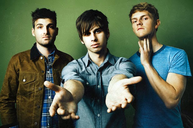
Overall, I think I want my artist to look similar to this:
I still think that the band Symptom, should focus more on the frontman rather than the band behind it. I think maybe 2 or 3 other guys that look similar to this would be enough to complete the band.
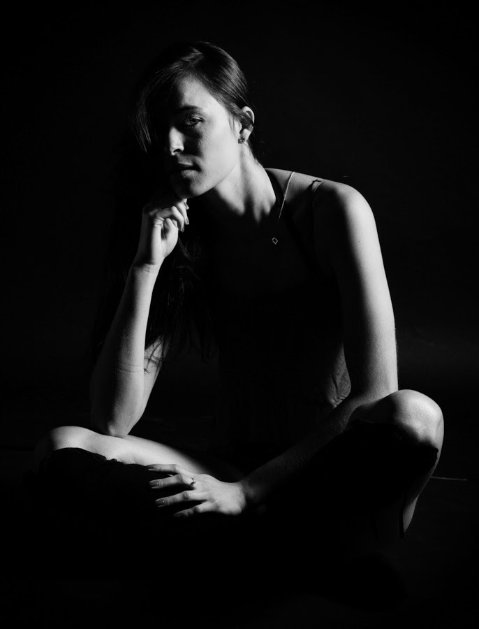
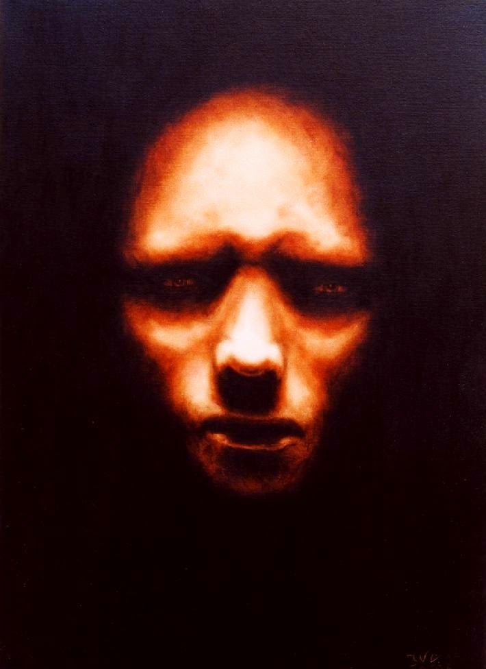
I think if I take some chiaroscuro images such as these:
I think it could look aesthetically pleasing for my digipak for the band.
Subscribe to:
Posts (Atom)