As pointed out in my feedback sheets my music video is quite current with the Sia music videos due to the blonde wigs and the idea of the young girl being mentally unstable. Perhaps due to the media I was subconsciously influenced by these current videos:
A video that influenced with me by making a film that deals with unstable mentality has also slightly influenced me in creating my music., especially the part of the music video where the protagonist throws the chair.

Showing posts with label Influence. Show all posts
Showing posts with label Influence. Show all posts
Friday, 23 January 2015

Sunday, 28 December 2014
Influences for Music Video
In my research I came across a music video I quite like.
The use of changing opacity reminds me of Richard Misrach's work

Which was the inspiration (and also an influence) for the title sequence of True Detective
For my own title sequence I plan to use this style in the performance section of my video when the band are playing.
The use of changing opacity reminds me of Richard Misrach's work
Which was the inspiration (and also an influence) for the title sequence of True Detective
For my own title sequence I plan to use this style in the performance section of my video when the band are playing.
Wednesday, 10 December 2014
Influences for Music Video
I am influenced by this music video as the sad narrative inspired me to create something similar but with more meaning as the character changes. I also like that the video is in black and white, which emphasises the narrative and the meaning of the video. It also fits into genre conventions - perhaps something I should also create.
I was inspired by this video as the video has clones of the band, which the band confront - similarly I would also like to create in my own music video, as I want the child in my music video to confront her reflection and destroy her. I also like the pace of this music video as it is synchronous to the music and visuals.
I like this music video due to the desaturated colouring of the video and the dark style which has influenced me to create a similar style in the editing process of my music video.
Friday, 5 December 2014
Influences - TV Show: Damages
This is the title sequence for a TV show that uses the chorus of my chosen song. The TV show is about crime and law. I like the idea of justice and fighting; hence where I got the idea for my music video. In terms of style I like the colour palette used within the title sequence and the idea of dark shadows - like chiaroscuro lighting, which I would like to use for my music video. I especially like the shot of the protagonist lifting her head from a side and front profile which I intend to use as an intertextual reference in my music video. I like the use of depth of field and focus on the characters, which I also intend to use for my music video. I also like the use of slow motion in certain parts, I think it intensifies parts of the sequence which I would like to use in my music video.
Friday, 14 November 2014
Lyrics

I printed off the lyrics and followed the song, inserting where I would like which shot and type of editing feature I would use etc.
Monday, 20 October 2014

Tuesday, 14 October 2014
Digipak plan and stuff

This is my digipak plan (so far).
1. (Pink circle with lines through it) I plan to have the band members face aligned and edited with a neon colour scheme for the front cover.
2. (The green and grey thing with grey blocks) This is the back cover, the grey block represent track listing. I plan to have a landscape image with the image of the band faded into it.
3. (the sound board) To represent the electronic side, I plan to have an image of the studio/ instruments/ sound board.
4. (The audience) I want an image of a live performance/ audience to represent the rock/ indie genre, but also the neon lights to show electronic. I think this will work well since there will be a dvd accompanying the cd within the digipak.
5. (The question mark) I am unsure what to put there as of now.
6. (They grey circle) A Chiaroscuro image of the band - shows them as a brand.

I tried another generator - which I don't really like.

I found this font on dafont, which I would like to try.
Experimenting
I was influenced by neon signs like these:

I found an online generator and used that - but I'm not sure how I feel about it.


Perhaps I could create a sign for Symptoms that follows this.
I found an online generator and used that - but I'm not sure how I feel about it.
So I created my own version which I dislike. I think I should use glowsticks or find a font that would make it work.
Stuck
I think I'm really stuck for ideas right now; what I want my artist to look like and how I want my digipak to look.
I looked at bands that were similar to my own.
The Killers:




I think it could look aesthetically pleasing for my digipak for the band.
I looked at bands that were similar to my own.
The Killers:
This is what the band look like; I like this casual style that they wear, but I think it's a little too dressy for my band. I like the use of colour in the album cover and is something that I would like to use on my own. I have an idea of neon colours to be used in my album to adhere to the conventions of the electronic genre.
AWOLNATION :
The like the style which AWOLNATION wear; I think it's really casual and laid back - something I want my band to be similar to. I like the obscure album cover and the colour palette, which is conventional of the genre for Electronic Indie Rock.
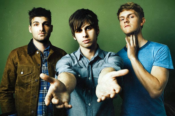
Foster The People:
I like the artsy image for the album cover; I would really like to illustrate something so this album cover; if not then play around with editing photographs from the photo shoot I will take. The band also wear casual clothes like AWOLNATION which I really like and think connotes my band well.
Overall, I think I want my artist to look similar to this:
I still think that the band Symptom, should focus more on the frontman rather than the band behind it. I think maybe 2 or 3 other guys that look similar to this would be enough to complete the band.
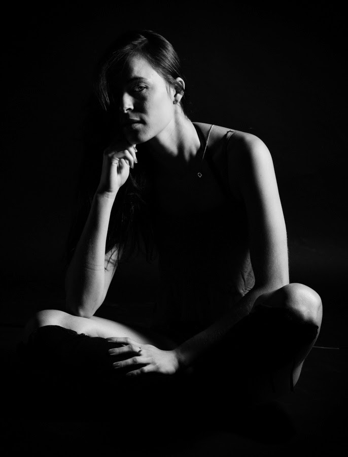
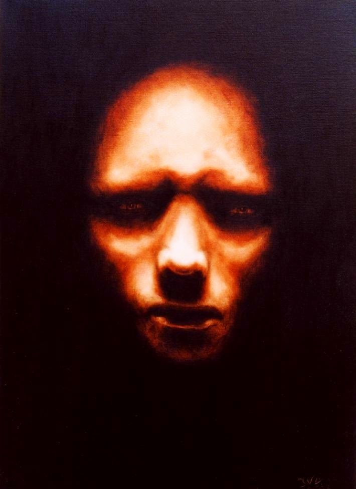
I think if I take some chiaroscuro images such as these:
I think it could look aesthetically pleasing for my digipak for the band.
Friday, 3 October 2014
Subscribe to:
Posts (Atom)